Graphic Designer - Digital Marketer -All Round Creative
ABOUT L WHY CREATIVE
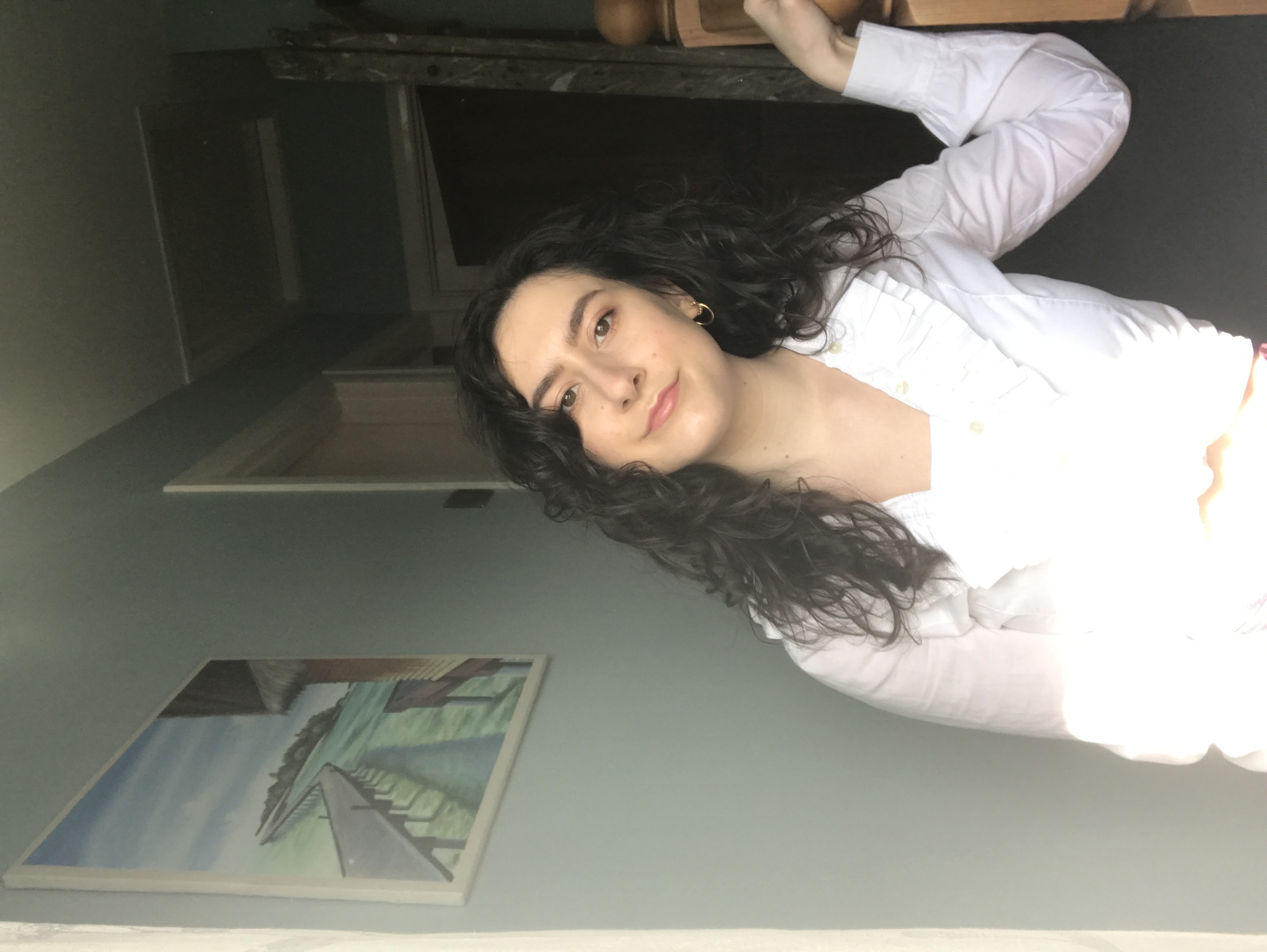
I’m Holly, a Graphic Designer and Digital Marketer with a passion for all things creative.
With a background of graphic design, digital marketing, social media marketing and smidge of website/SEO knowledge, I’m here to showcase what I can do.
Finding new ways to be creative is a passion of mine. I studied graphic design and fell in LOVE with it. I may not have been the best but my mindset was there. I just needed to have the faith in myself that others around me showed. Now I’m looking back at my work and repurposing the concepts with my newfound knowledge…I’m not saying my designs weren’t great but I definitely know more about what people like and what they want to see. Saying I liked one thing and doing it were two very different things. I’m just glad my passion was always there and even if I create something a bit unusual, I knew I was still heading in the right direction!
Portfolio
My designs through the years with a helping hand of recreation
My designs through the years have been through it. Starting off so confident, which is great but not really seeing how my designs were not where they needed to be in the moment. My designs have definitely improved and I love what I am creating now. I’ve strayed away from what I wasn’t brilliant at and focused on my skills for a more grandeur, dare I say, style.

Off The Record
View Project ›
Mona Leesa
View Project ›
Chanel Artwork
View Project ›
The Pancake House
View Project ›
BCR Chocolaterie by Antonia
View Project ›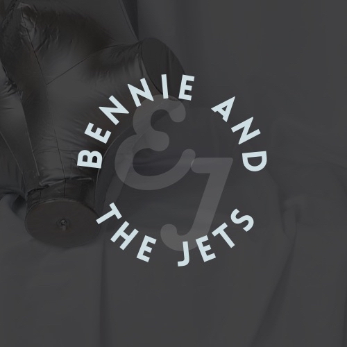
Bennie and the Jets
View Project ›
Typeograpgy
View Project ›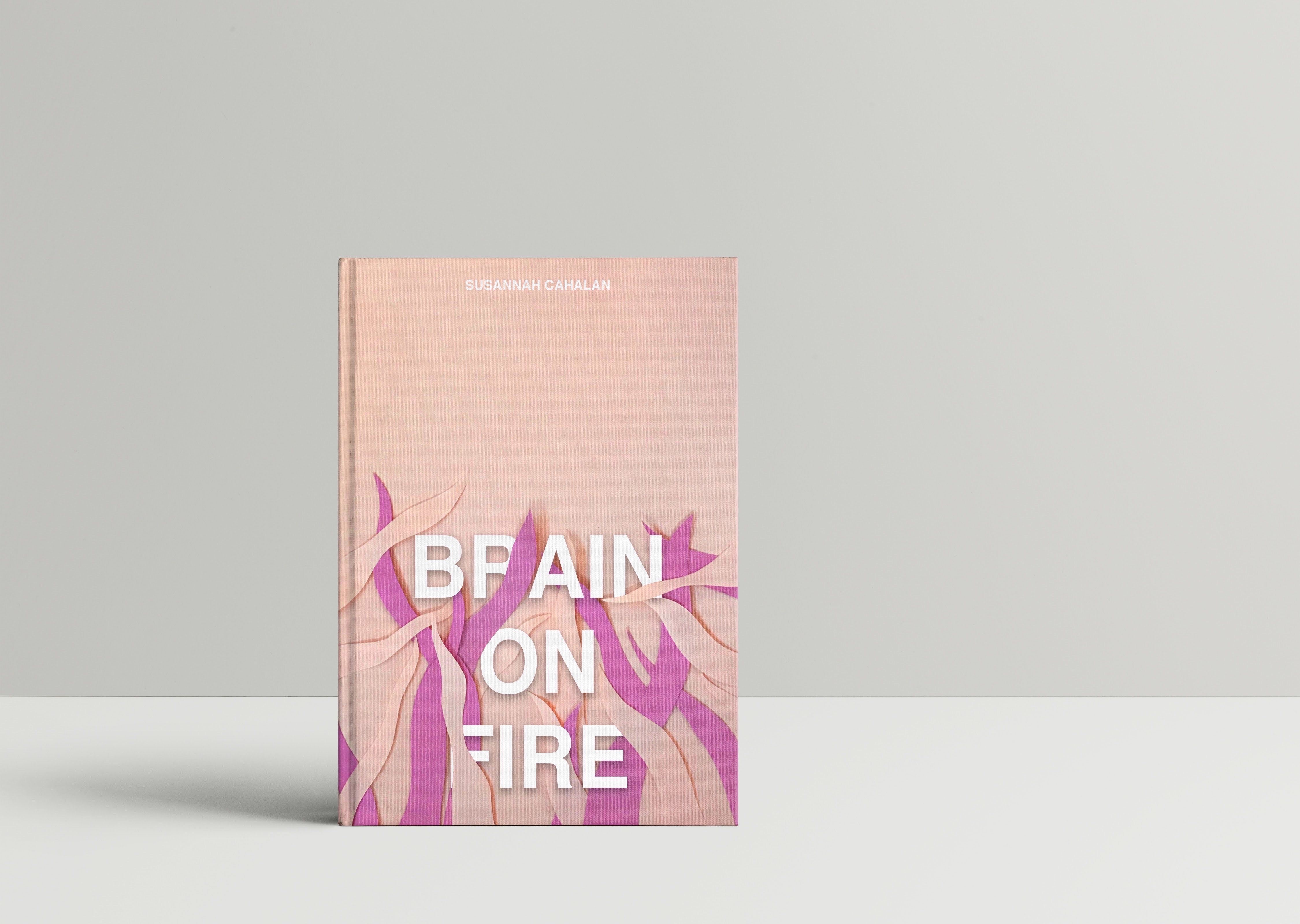
Brain On Fire
View Project ›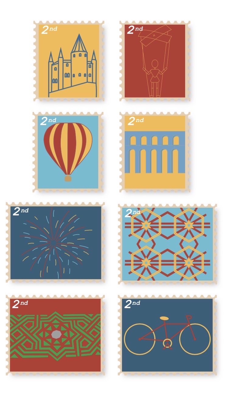
Branding Stamps
View Project ›
Sun Drawings - Photography
View Project ›
Parla Sugar - Packaging Design
View Project ›
Portfolio - Off The Record
Branding
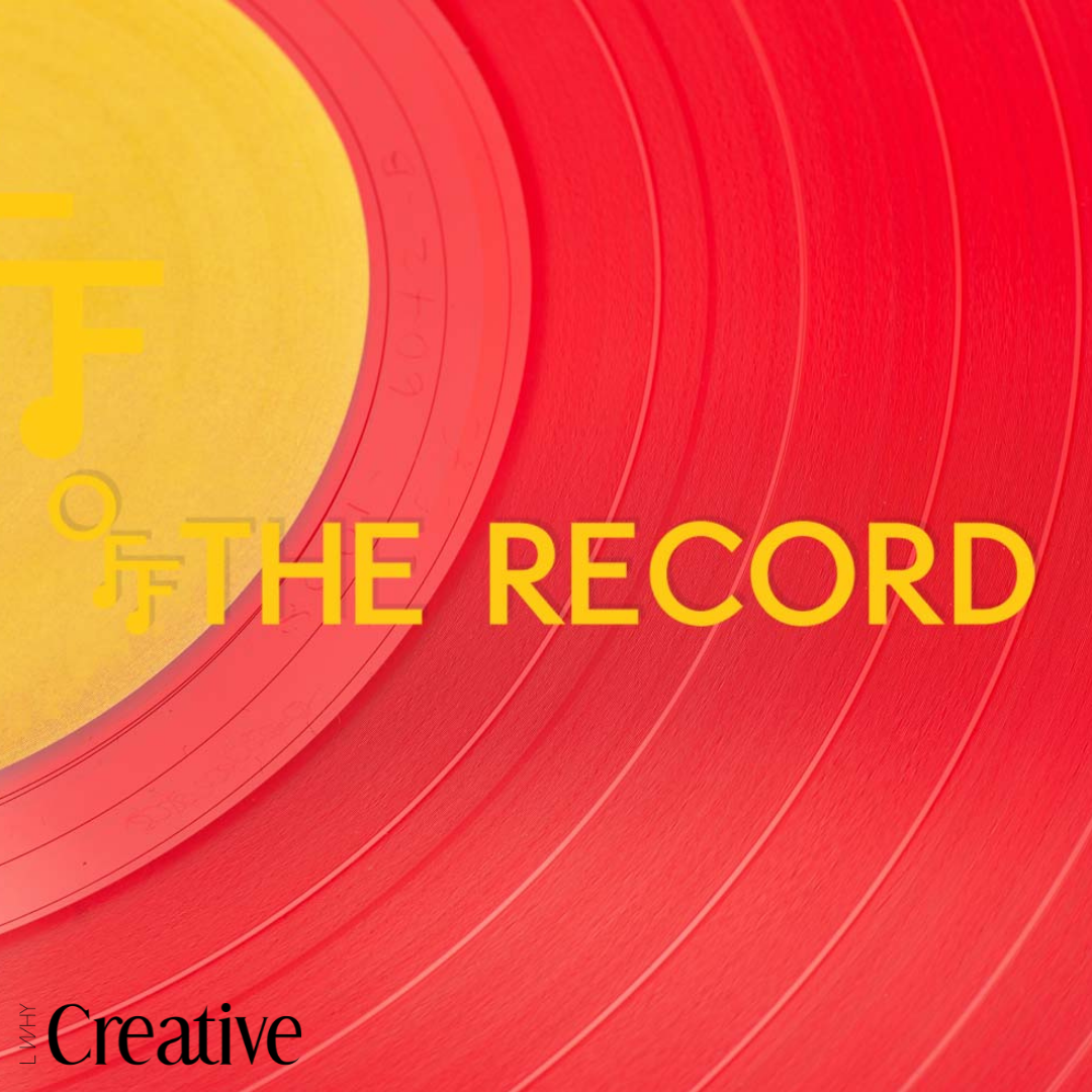
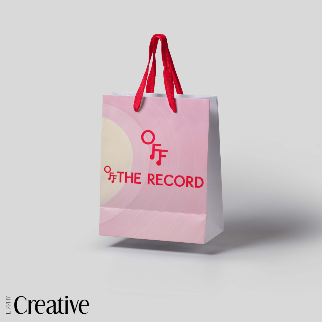
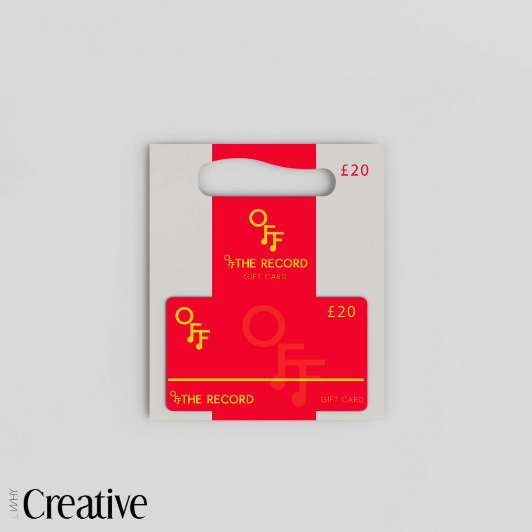
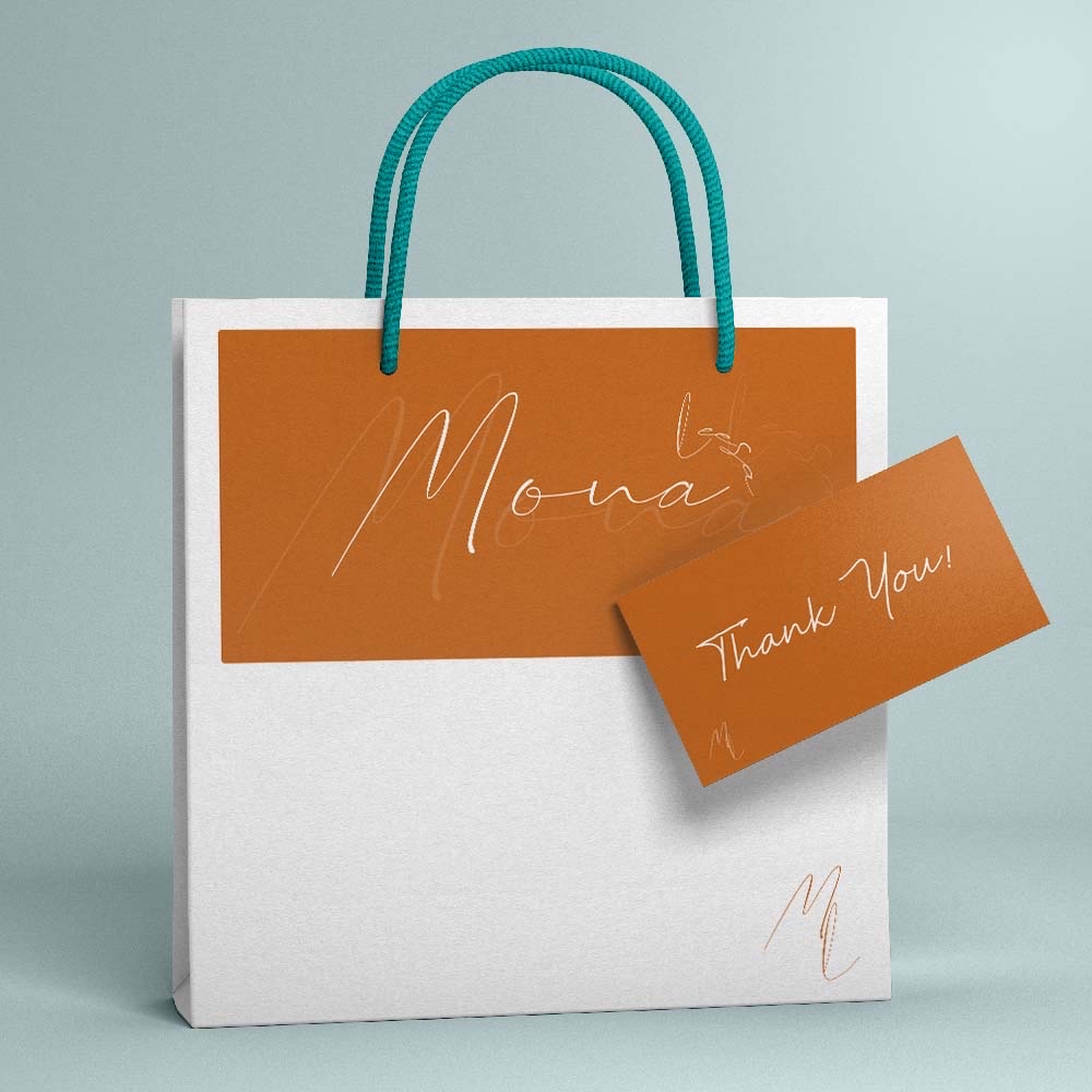
Off the record is a fictional brief for a music shop. The brief entailed the creation of a logo and packaging for the shop, as well as anything else the designer see for. Going for a classic red and yellow colour palette, I created a bright and energetic design. Still in keeping with a simplistic approach, I designed the logo alongside packaging of a bag and a gift card for the shop.
Portfolio - Mona Leesa
Branding
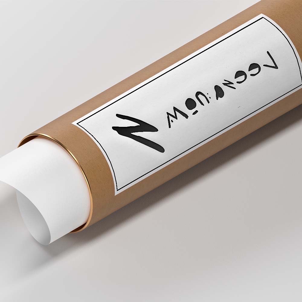
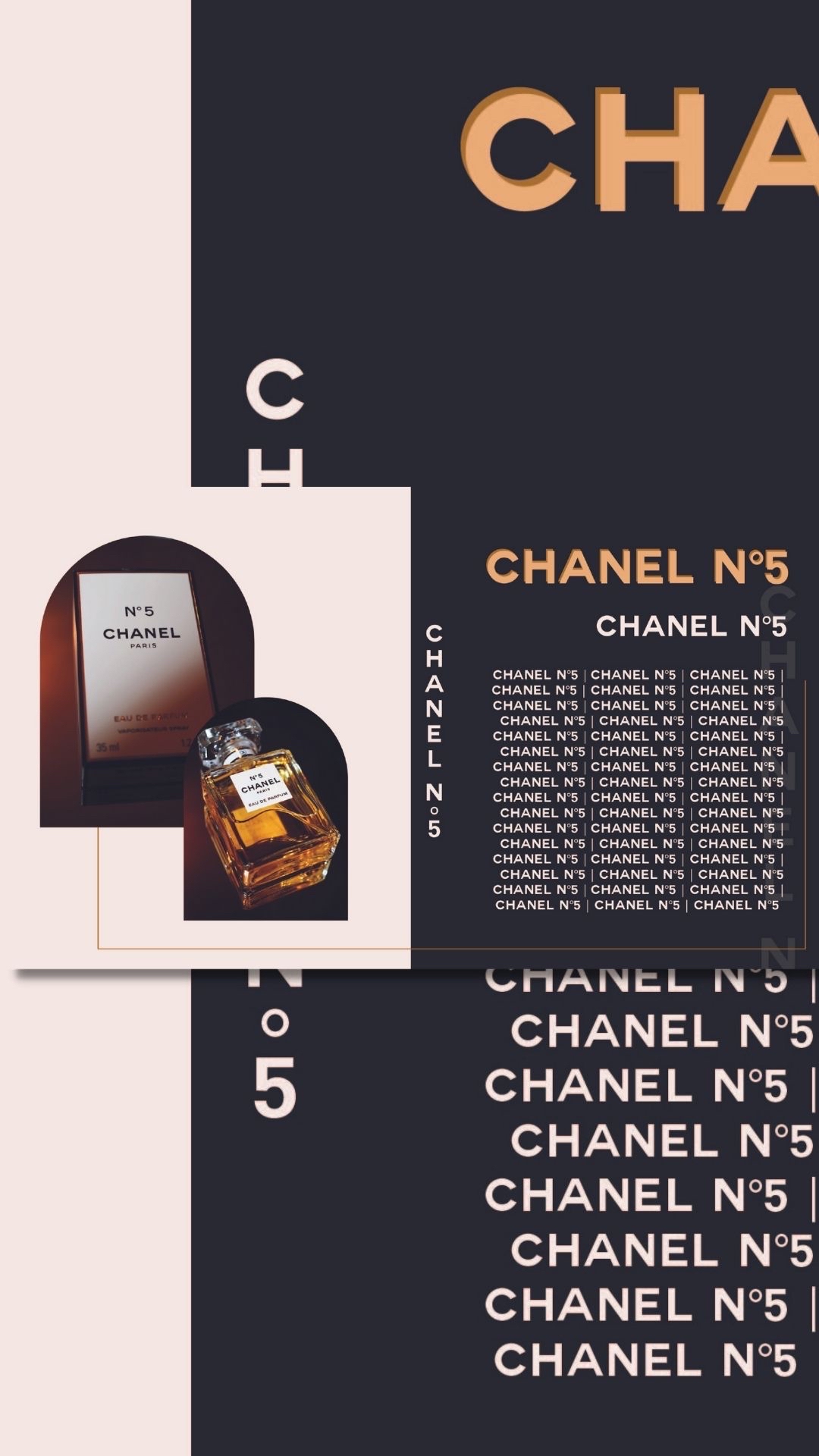
Mona Leesa is a fictional brief set by @hellotayloramy on Instagram. The brief was to create a logo and sun logo for packaging that art could be purchased or packaged for delivery. My two concepts contain a professional light hearted look with a teal and burnt orange colour palette. A part of this was to challenge yourself with a font you hate. For a second concept, I used a font I thought would look terrible and managed to create something quite unique and interesting. Using only black and white as my colour palette, I think the graphical look is more enticing on the second concept than the first.

Portfolio - Chanel Artwork
Graphic Design
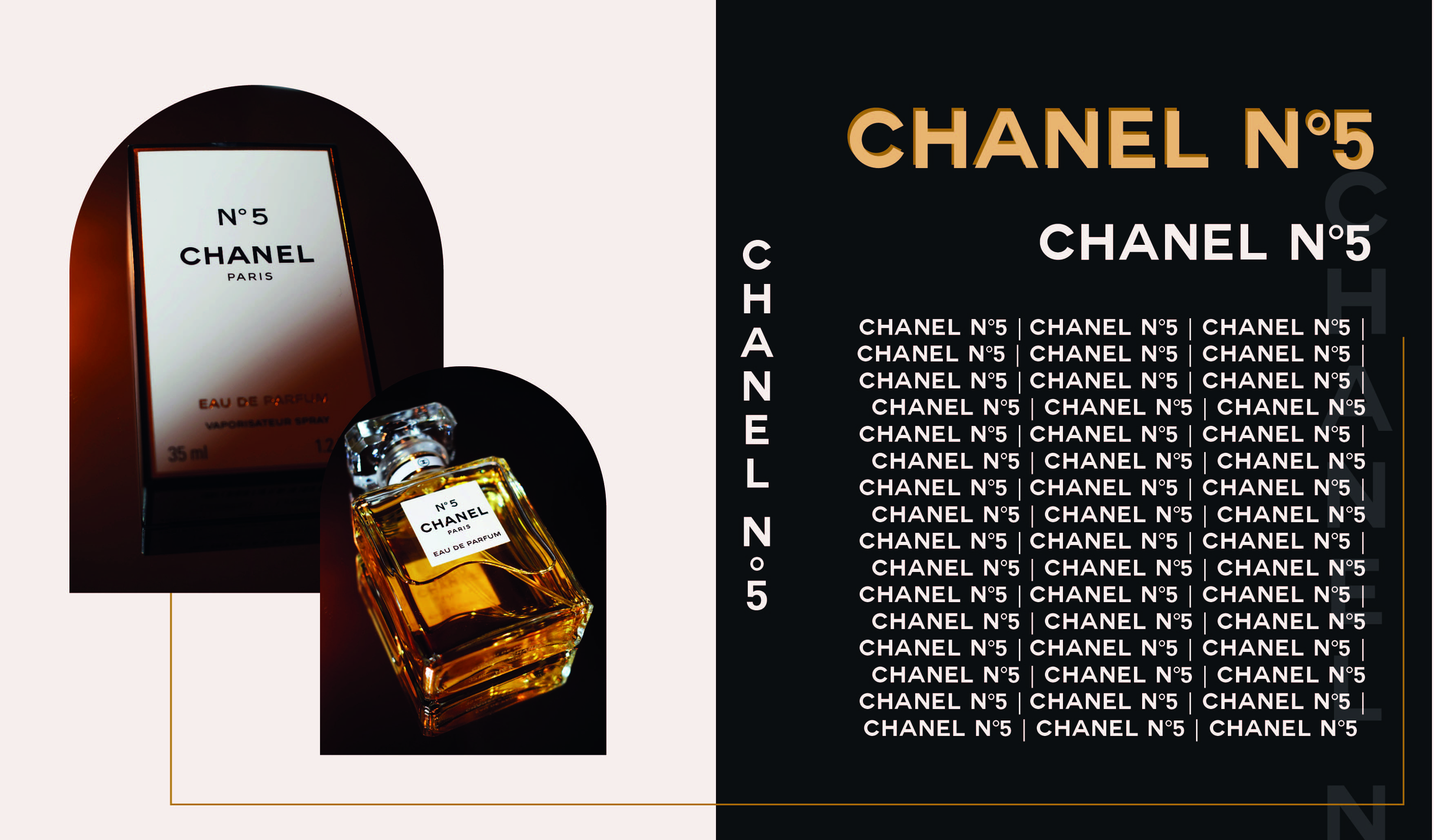
Taking the concept of a luxury brand, this artwork incorporates a use of photography and design using Chanel No5 perfume. Creating a modern yet minimal design, this page style concept includes typography and simplistic style with the brands colours and typeface for a different take on a high end brand.

Portfolio - The Pancake House
Branding
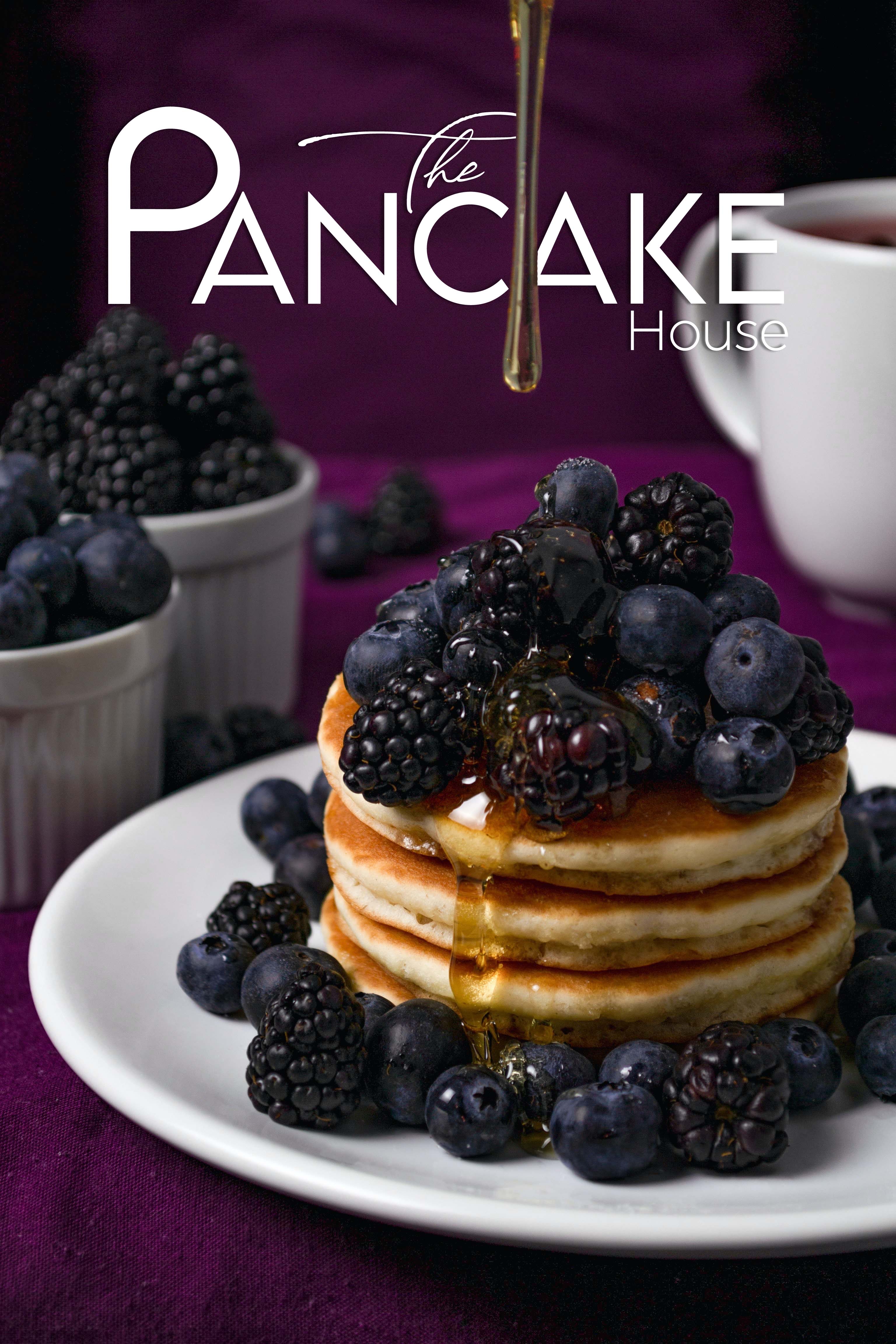
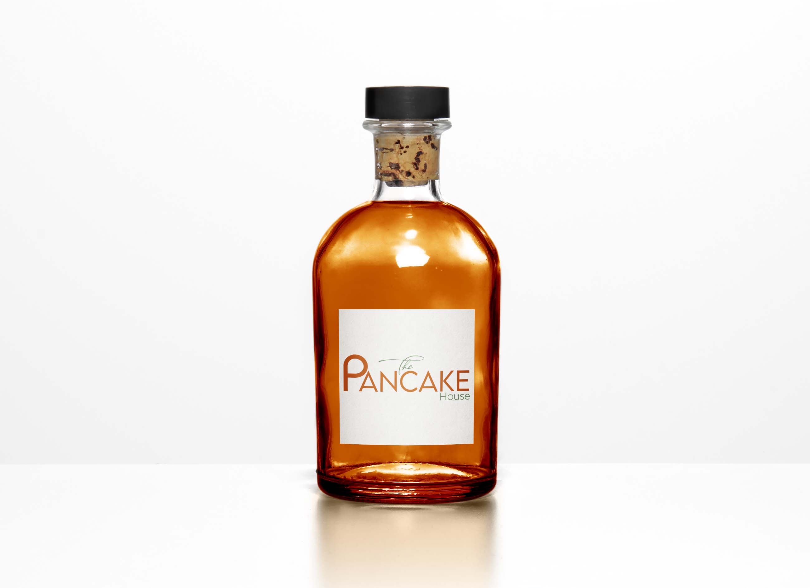
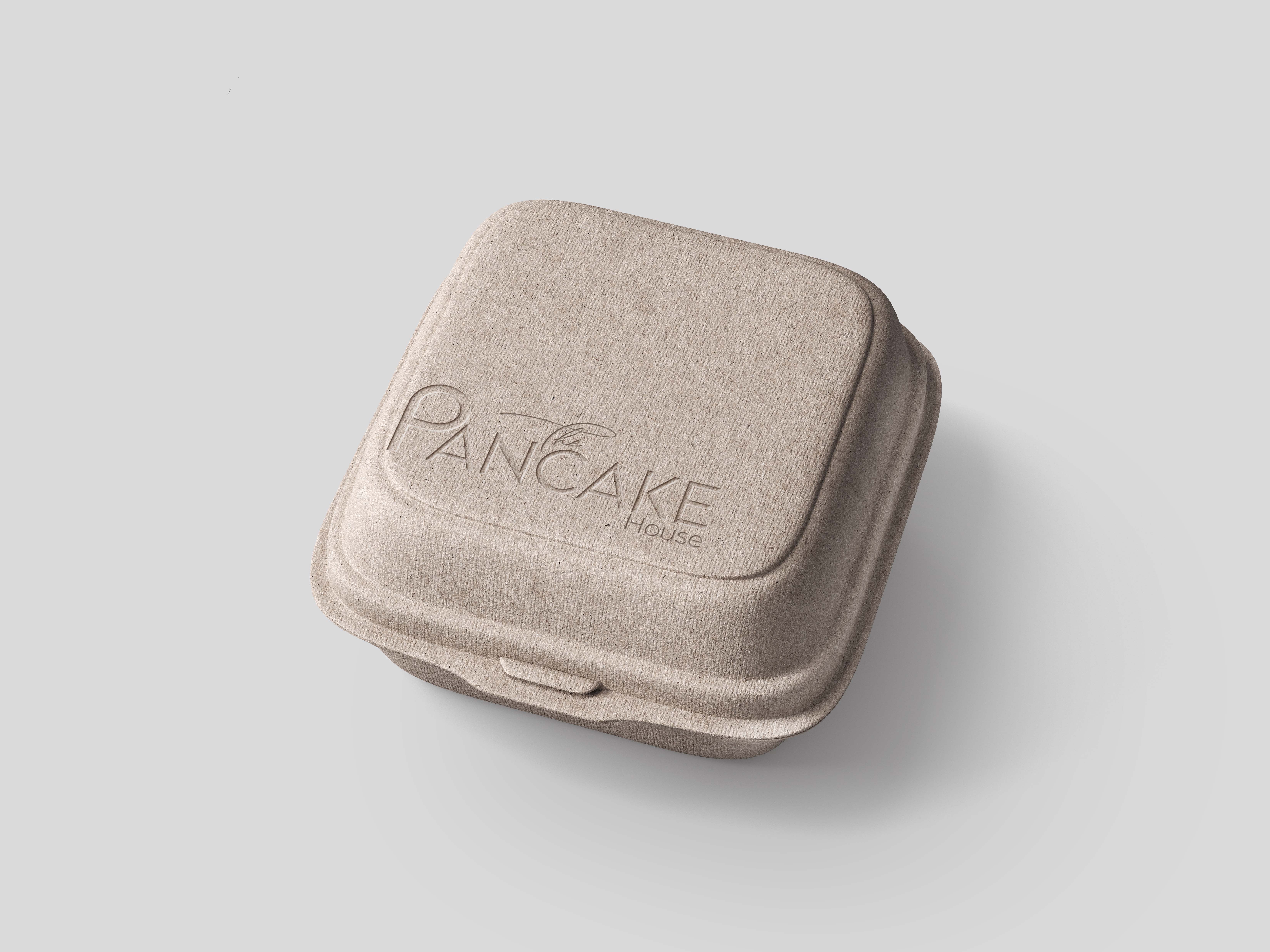
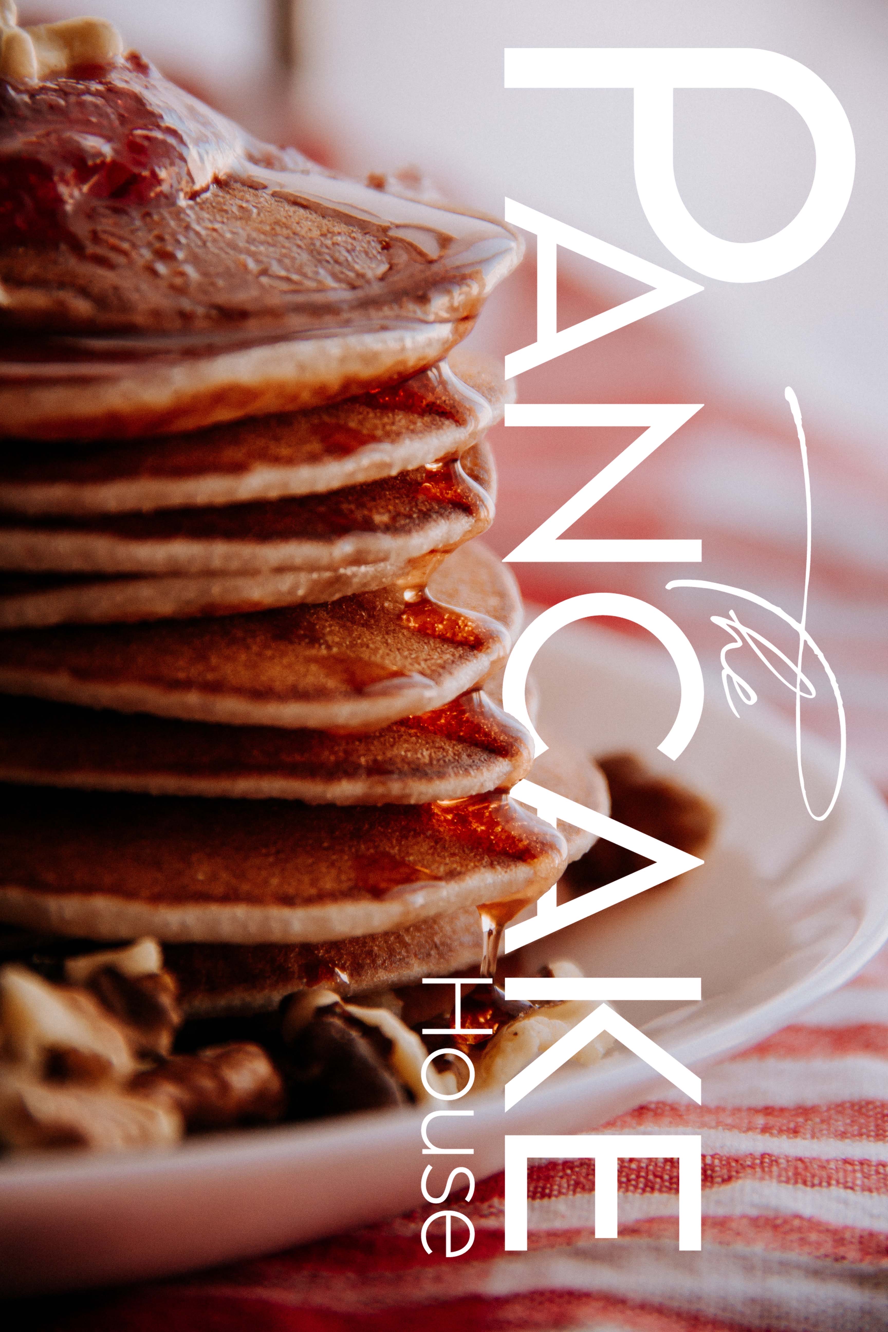
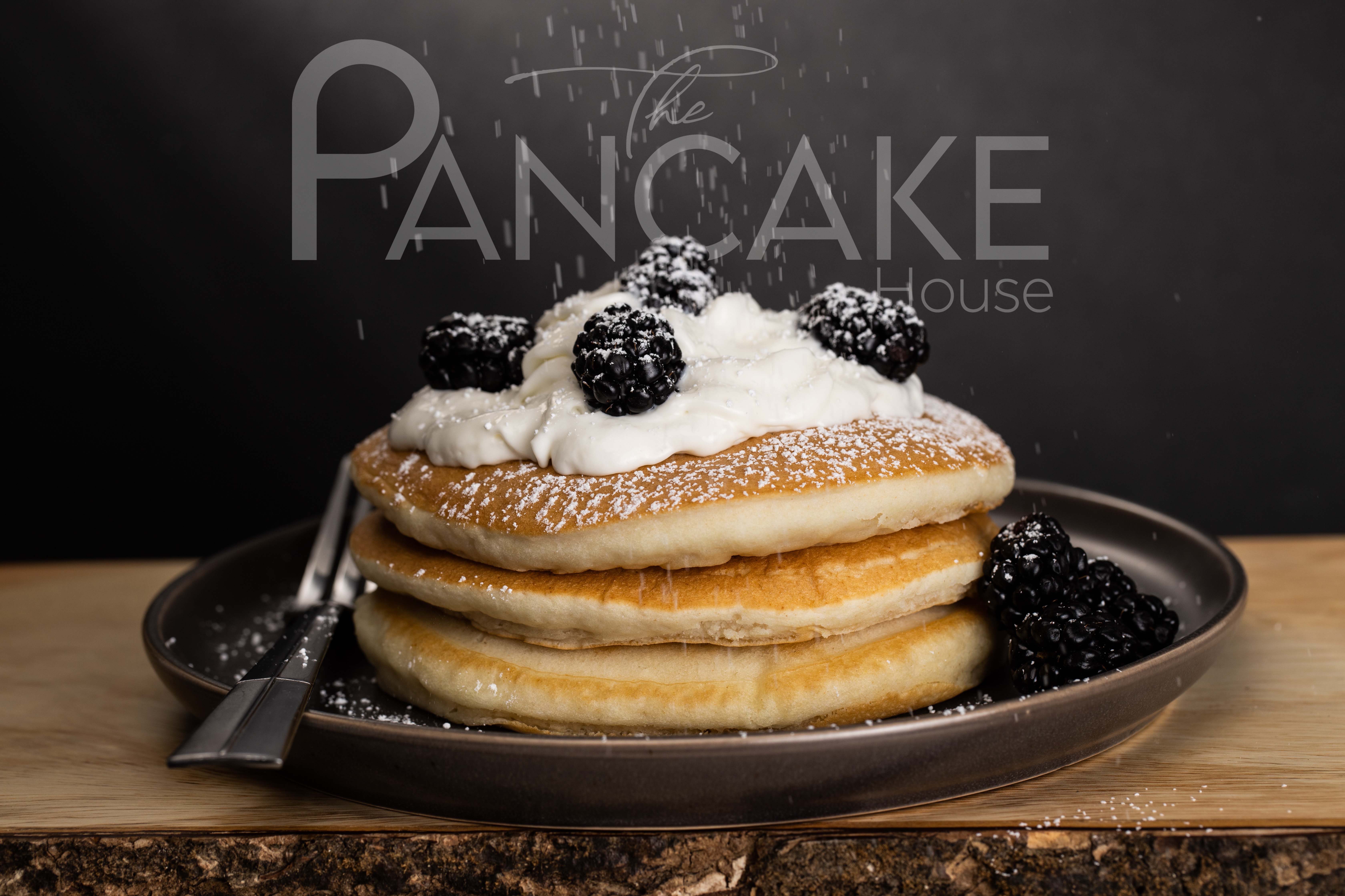
Pancake house is a fictional brief to create simplistic branding. Typography has taken a big part of this concept, utilising varied fonts and taking advantage of manipulating the typeface. Using the branding I have created product packaging and imagery for the brand which relay a fun and exciting side to a high end brand.
Portfolio - BCR Chocolaterie by Antonia
Branding
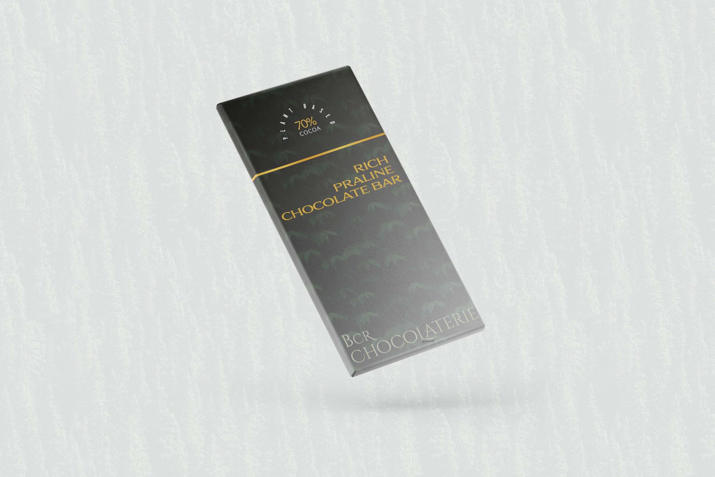
A fictional brief to create luxe branding for a new plant based chocolate bar. Using pattern design as a base for my typography, I incorporated earthy elements to showcase the eco friendly ethos of the brand. The high end design within the typography shows the luxury brand whilst the background packaging intends to emphasise the importance of being eco friendly even with the stigma of current times.
Portfolio - Bennie and the Jets
Vinyl Cover Art
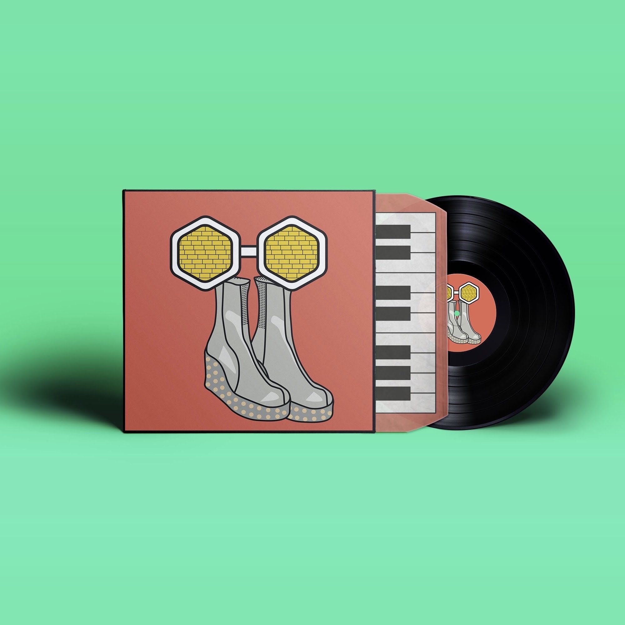
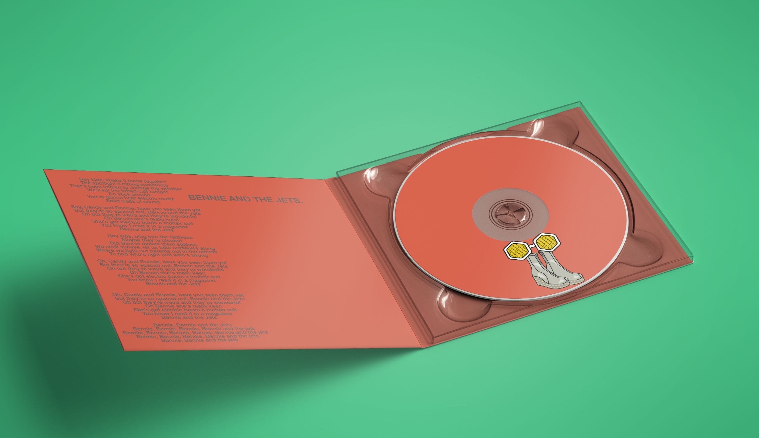
Now one of my favourite past briefs have been creating a vinyl cover design for a song. Given the choice of three songs, I obviously chose Bennie and the Jets. Being a huge Elton John fan I knew I had to. I created a design inspired by my love of digital illustration…I just didn’t really have the talent to back it up. Now the original designs weren’t terrible, but compared to any original vinyl art I was way off. I’ve since recreated a new styled design which I’m sure I’ll come to recreate again in the near future.

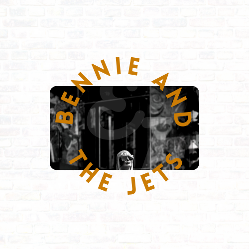
Previous Vinyl Cover Art

Portfolio - Typography
Typography
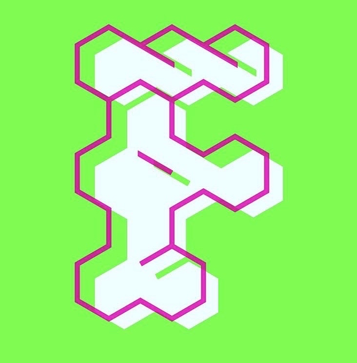
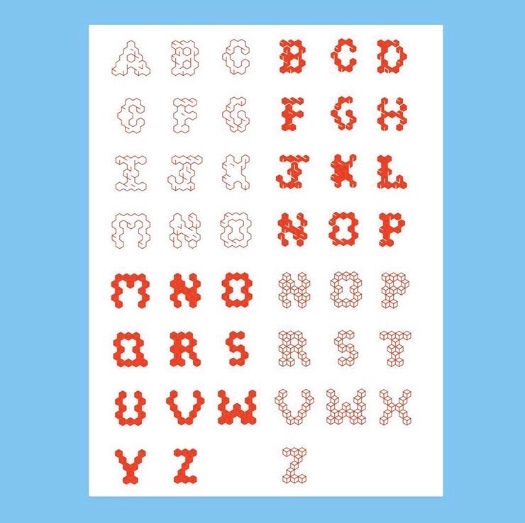
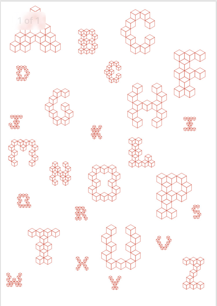
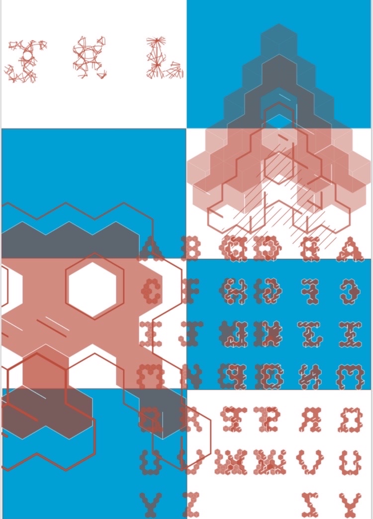
Typography is one of my favourite parts of designing. Bringing a concept to life with a wonderful paring of fonts is amazing. What’s even better is creating your own typeface…or at least something of the sort. A brief I was given when studying graphic design was to choose from a variety of template grids. From there, I was challenged with my interpretation of what the grid was. I found my identity for the grid and how I preferred to view it for what shapes I wanted to be visible within my design. Creating a 3d block design was my go to with this concept. Through colour and placement I was able to manipulate the 3d blocks into various shapes within each letter for unlimited type which has allowed me to create different concepts within one.


Portfolio - Book Cover Art
Book Cover Art
Brain On Fire was another brief which allowed me to be creative. Originally wanting to take the digital illustration route, I was talked into a more graphic style which quite frankly I’m very glad about. In my illustration I took the literal route of a brain on fire. Through a graphical take, I managed to create a physical book cover using materials of different paper. In creating a 3d style cover I used the nicer shades of pink for a link to the brain whilst still allowing for an approachable book cover. Photographing my book cover with paper flames I allowed myself to digitally add typography of the book title for a mix of physical and digital design.


Portfolio - Branding Stamps
Branding Stamps
Branded stamps was another beloved brief of mine when studying graphic design. This is one of the few projects using digital illustration that I am proud of. My style of digital illustration was never on par with others but had its chance to shine within these stamps. I was given a place in a country, Segovia, which I was to intensely research to design stamp concepts to proudly showcase the location for its heritage and most important parts that made up Segovia.


Portfolio - Sun Drawings
Photography
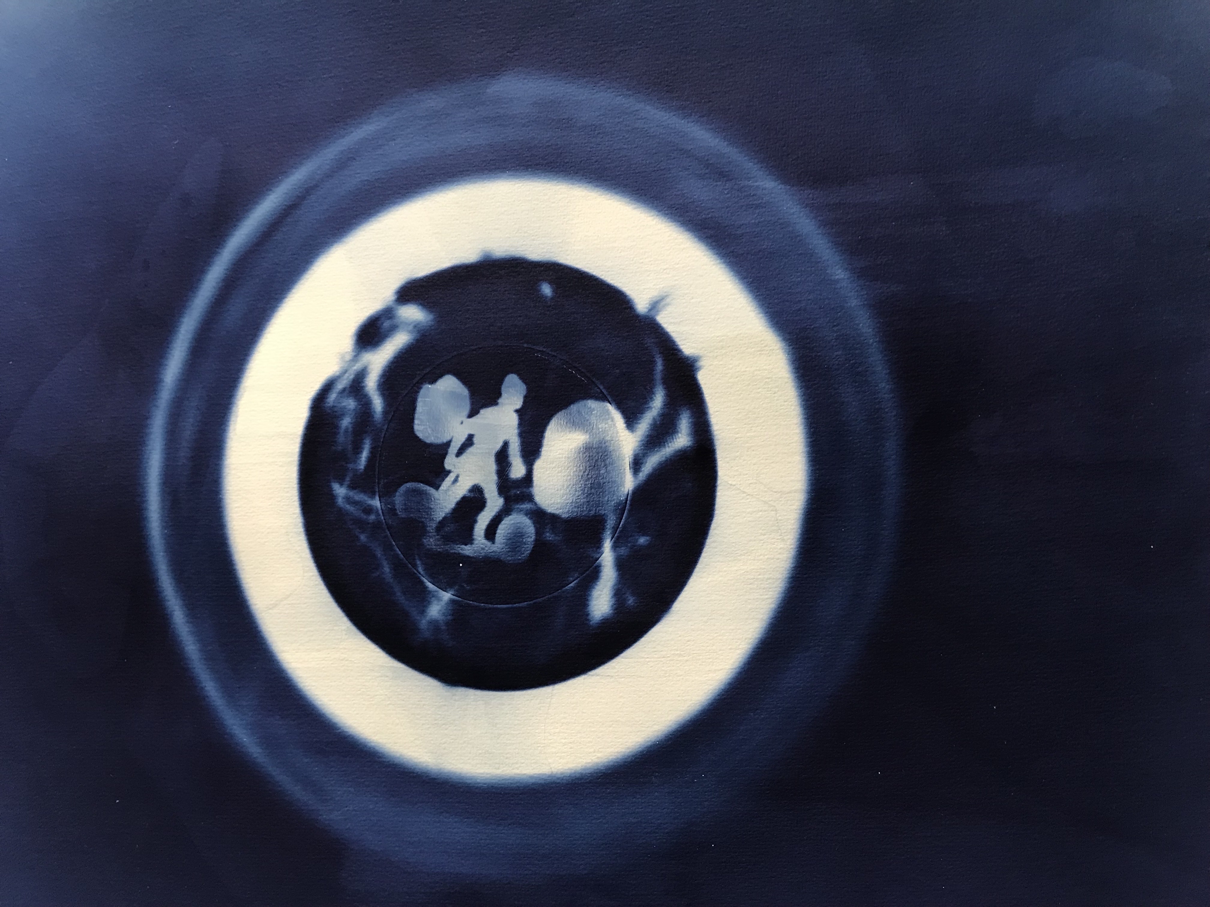
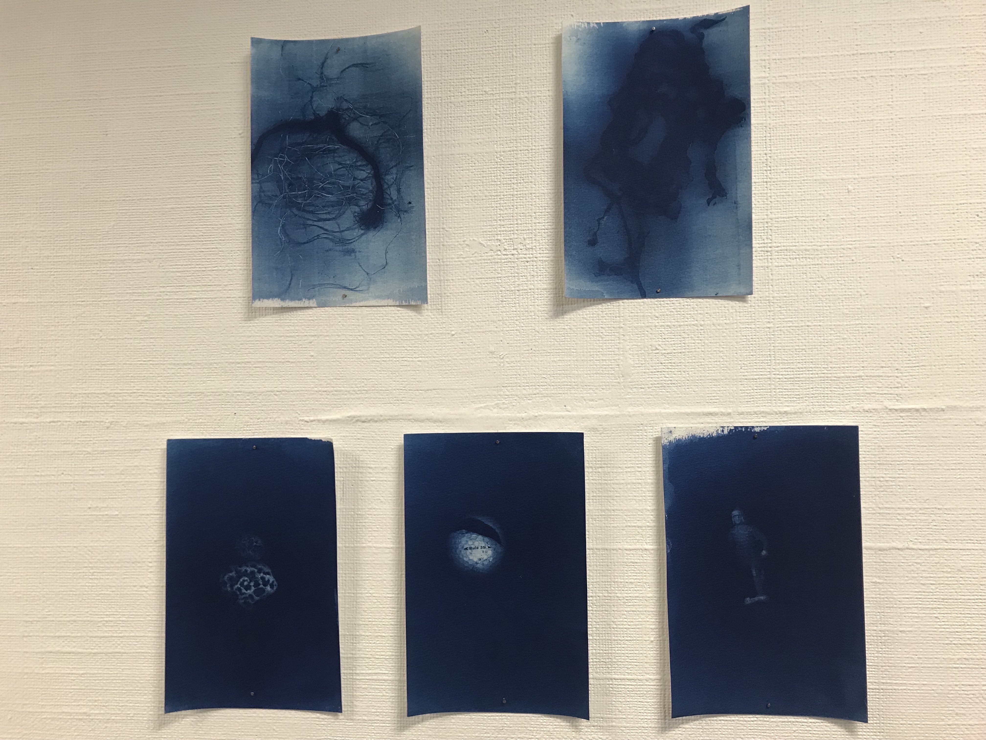
Sun Drawings are one of my favourite parts of photography. I studied photography briefly alongside Graphic Design and allowed my creator flare to connect the two with the physical side to photography. A concept of mine for my final piece was collecting forgotten valuables from beaches near to me. My brief was based on the moon and it’s phases so I took this concept and ran with it. Using the connection of the tides to the moon, I created these beautiful blue pieces which showcased the items within a bowl. When the paper was exposed to light the items became visible on the paper to create my piece of forgotten value.
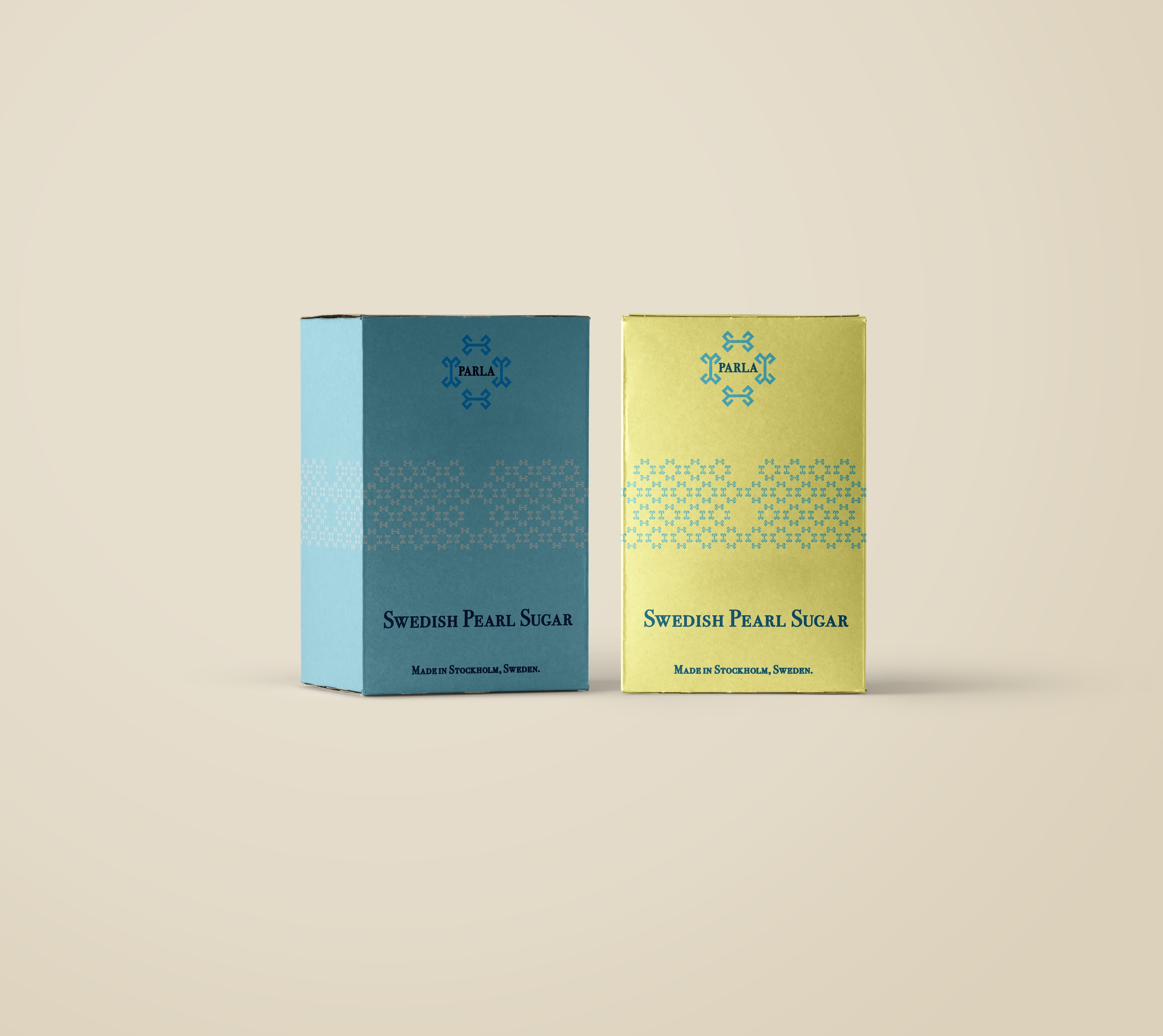
Portfolio - Packaging Parla Sugar
Packaging Design
This is a brief I would love to revisit! Packaging design is amazing and you can do so many things from bubbly and cute to high end luxury. This brief was to take a country and find something from the location that was relevant. Sweden was the location and Parla Sugar was my choice of product. The designs I came up with tried to be a mix of bubbly and bright and heading down the high end style. Looking back I definitely took my research and tried to encompass it all into one design rather than picking a path and sticking to it. My idea now is to create a luxe brand with dark packaging to allow the Parla sugar product to stand out, mixing light and dark shades. I will use typography to create branding of simplicity with a subdued design…watch this space.
